Implementing psychology in web design strategy means designing a website considering what potential customers think, comprehending their minds, and convincing them to act towards conversion. With wide-ranging experience in web design and its domain, we will introduce you to the basics of constituting psychology in establishing web design. A guide through understanding design trends and practicing marketing psychology will be provided by our agency AlphaEfficiency.

1. Building trust
Trust is crucial in visitors deciding whether they will become a shopper or not. Extremely unique and creatively far from norms, a website can cause suspicion in visitors. Authenticity is welcome in web design, but too exotic appear can be counterproductive. A dose of familiarity, standards, and expectations is necessary for gaining the trust and comfortable feeling of visitors. Keep web design with a recognizable pattern while making it stand out in the sea of similar websites.
2. Psychological Triggers
All website-design elements combined trigger the initial decision of the visitor to become a buyer. These elements such as theme color, font style, text, shapes, graphics, and others, are the instruments to take advantage of and make an impressive website. Making smart choices about these elements and reinforcing the content can make an emotional and psychological trigger that will nudge the visitor to break into the decision.
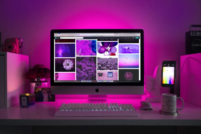
Suitable images can present your brand, product, or service clearly while provoking an engaging reaction.
3. The serial position effect
This effect relates to the position of the items on the list. This theory assumes that visitors tend to recall the first or last items appearing in the list, rather than the ones in the middle. The primacy effect states that the user evokes better the first information in the series, due to the small value of previously perceived information and processing efforts. On the opposite, the recency effect theory disposes of the option of better rehearsing the last seen items and information at the end due to the short-term memory impacts.
4. Mental models
Mental modeling is the marking process of what the human brain acknowledges about the real world through experience and reproduction of those models in web design. This method implies synchronization of the visual moving left to right, top to bottom, and is the message you want to send to the audience clearly and understandable. Line up all the relevant information by this pattern to provide natural coherence.
5. The paradox of choice
This effect states that providing too many options for potential buyers can result in hesitation and indecision. To prevent the possibility of losing clients due to the paradox of choice effect, we advise you to limit the number of CTA buttons, reduce the infinite scrolling, and enable filters.
6. The Von Restorff Effect
The Von Restorff effect, “the isolation effect”, is a useful method to draw visitors’ attention to a particular element on the page. This strategy stands that the people remember the objects that stand out in any way. To make your website visitors remember a certain item make it prominent by choosing the different colors, light, size, or other attributes that can highlight.
7. The Zeigarnik effect
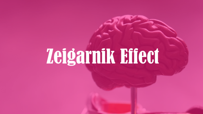
This tactic assumes that customers remember uncompleted tasks and recalls them in their mind. The advantage of this stand is in pursuing users to finish the started action. You can motivate and encourage customers to conclude by displaying the progress bar, providing incentives, or warning users about irreversible decisions and changes.
8. Gestalt Psychology arrangement
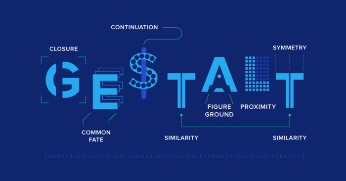
This psychological method in web design explores elements as a part of a complex system, and how these elements are grouped. Gestalt psychology observes the impact of these elements on visitors’ behavior arranged by:
- Similarity – Similar looking object will be recognized as part of one object, or group of objects, perceiving the concept without distinguishing a particular object.
- Proximity – this is the idea of placing objects close to each other for providing the impression of the objects as part of the same group.
- Continuity – it occurs when visitors’ sight moves naturally from one object to another and one side to another (left to right)
- Closure – objects that are not put close are perceived as the whole
- Figure and Ground – This way of organizing objects, a perceptual grouping of objects, refers to our visual simplifying objects images into two main objects figure and background.
9. Psychology of Shapes
The human brain tends to connect certain shapes with appropriate emotions or characteristics. The brands use shapes to provide the desirable link between design and the impression they want to achieve in visitors. The subconscious association with basic shapes:
- Triangles, arrows, and squares – are related to balance, stability, efficiency, strength, professionalism, decision, and masculinity.
- Circles, ovals, and eclipses – corresponds with positive emotions like unity, love, friendship, and feminity.
- Horizontal lines – equate tranquility, calm, peace, and community.
- Vertical lines – refer to aggression, strength, action, and masculinity.
10. Color psychology
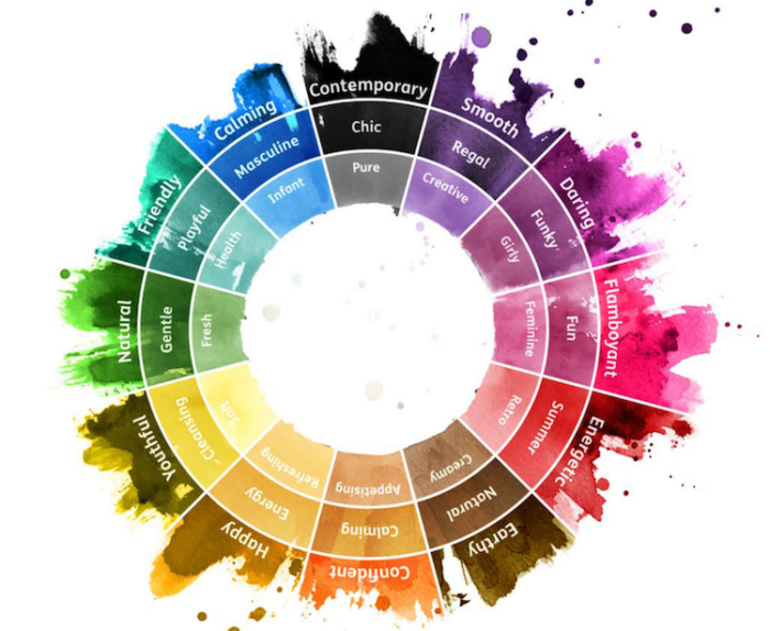
The importance of color in the human unconscious is rewarding in web design. Espouse the color that compliments your brand while causing a desirable feeling in customers. Appropriate color will provoke the feeling of warmth, excitement, amusement, or whatever you prefer. Different colors attract visitors and broadcast different messages. Besides, this ability and color improve brand distinction and recognition by 80%. When creating web design pay attention to the effect of certain colors and apply them following your brand’s characteristics and the desired impression you want to leave to the visitors. When choosing the right color for your website consider these questions: What is the purpose of your website? Who is your audience? What mood do you want to create? Establish the color scheme of your web design appropriate to your brand propositions and the message you want to send.
Blue
In web design, the blue color is associated with security, trust, and care. Therefore blue is the safest and most liked color. Most brand uses this color for broadcasting the message of strong and secure service.
Orange
Orange color is widely used in web design for projecting an impression of being sociable, friendly, and affordable.
Purple
Purple in web design is commonly used for providing nostalgic, creative, and imaginative impact. Purple also suggests wisdom, calm, and bravery. The combination of purple and orange is a great solution for driving visitors in the right direction. Purple used in the background corresponds to calmness and stability.
Yellow
Yellow is a happy color that evokes optimism, logic, and forward-thinking with playful and confidence.
Red
This action-eliciting color communicates with visitors with passion, energy, and excitement.
Black
The black color usually is allied with authority, formality, and sophistication. Many luxury brands use black color to attract the audience with its notion of seductiveness and exclusivity.
Green
The green color usually refers to something natural, fresh, or earth. That is why many organic food brands opt for this color, as well as the brands that produce healthy food or provide eco-friendly services.
Multi-color scheme
Multi-colored choices are related often to something cheerful, positive, and playful.
11. Usage of space in web design psychology
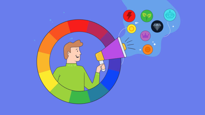
When using space in web design, consider that an overcrowded website is never a good idea. In the attempt to stand out from competitors, utilization of the space in web design doesn’t mean implementing all information, all we have to show, and all the innovative things. Too many graphics, pop-ups, CTAs, and word makes the website cluttered, chaotic and confusing. Wisely using white space as the visual resting place for users, has a significant part in space used. Provide a space for users to focus on the message you want to convey. Over-complicate wen design with obstructive elements can prevent the judgment in taking the action.
12. Fonts in the aspect of psychology
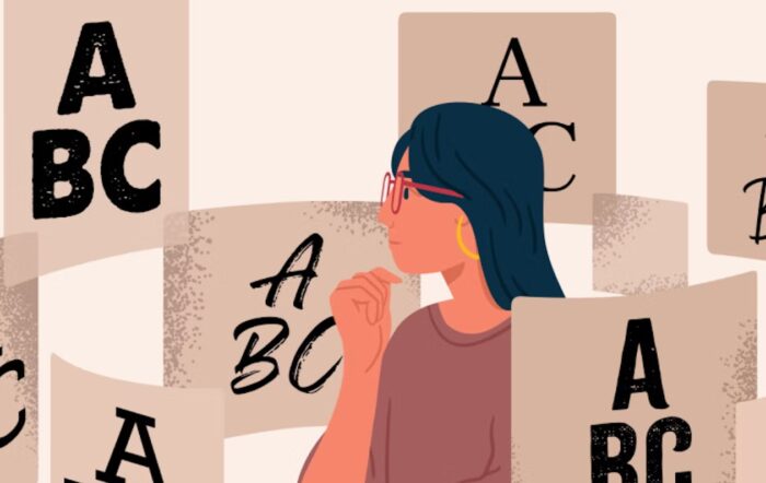
With different font styles, you can also impact the visitor’s unconsciousness. The psychology in font styles plays the same role as colors. By choosing the right font, you are making text readable while achieving the design balance. Use a minimal number of fonts instead of too many that visually fight for attention and make words hard to read. The simple and concisely worded message has a greater impact and delivers a clear note. Standard font styles such as Ariel or Helvetica are easier and faster to read, therefore appropriate for the body text as users are more familiar with them. Nonetheless, decorative and creative fonts are more suitable for headlines, calls to action, and other page elements that demand to be prominent, highlighted, and notable. Other tips for successfully implementing font psychology in web design are:
- avoid using all capital fonts in words
– choose font styles that look good, are readable, and distinguish in both small and capital letters
– select the contrast font color from the background
– elude the blinking fonts and red and green color of the fonts
Wrapping up
Implementing these psychological principles in web design will help you construct a visibly appealing, functional, engaging, and quickly loaded website. Successful web site communicates with their target audience using their language. Wed design should create a familiar feeling and content of the website for a specific audience. Use your intuition, knowledge of your audience, and previous techniques guides in web design to create and deliver your message productively.
Final Thoughts
As we have seen above, psychology impacts the core of web design principles for an efficient website. Methodologically used, psychology is a powerful tool that triggers and influences visitors in a manner to persuade them to take desirable actions. Successfully leveraging psychology into web design ensures the conversion of visitors into customers and the return on the investment.
The post Implementing Psychology to Achieve a Stellar Web Design appeared first on FotoLog.
from FotoLog https://ift.tt/zGSr91T
via IFTTT


0 Comments