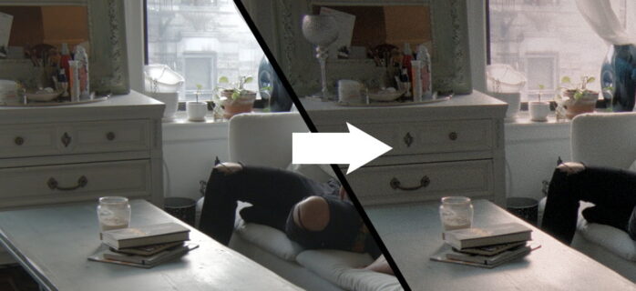
The dark mode is also called black mode, night mode, or dark theme. It is a type of screen and has a faint background with light text. The primary goal of creating a dark mode is to lessen the light emitted by the screen display and maintain readability at the same time.
On the other hand, light mode employs a light background with black text. It was created to simulate the experience of writing on paper, which is black ink on a slightly off-white colored paper surface. In general, every interface and almost all gadgets have light mode.
The dark mode features negative contrast polarity, while the light mode features positive contrast polarity. The debate between whether it is better to code in dark mode or night mode is nothing new as it has been going on for years. You can click here to look at the latest technical articles, guides to fixing errors, tips on gaming, simple desktop using tricks, and many more.
Comparing Essential Aspects Of Dark Mode Vs. Light Mode
Here, we will compare some of the vital aspects that specify which mode between dark Vs. light works best in different events.
Usability and visual differences

It is no doubt that dark mode is elegant and modern. With its refined and classy appearance, it evokes contradiction and solemnity. It is a decent option for formal occasions as it exudes strength and quality. When it comes to using these traits for marketing, dark mode is a great choice.
On the flip side, the light mode is straightforward. It is visually appealing, natural, clean, and readable. In comparison to dark mode, the light mode can present text more crisply and visually. The light mode can give the display an impression of clearness, purity, and clarity.
When reading using the light mode, you can feel more alert, and the text is emphasized involuntarily. It is absolutely the opposite of dark mode as it forces you to pay extra attention to the writing because it can be hard to read at times. When the text is small, it will be easy to read it in dark mode.
However, when the text is large, it becomes harder. It happens because of the halation effect. In the black background, there will be a blur on the edges of the radiant text, and it makes reading more difficult.
Work productivity

Battery usage is significantly lower in dark mode than in light mode. It is because the gadget works easily while running on a black background rather than lighting the entire screen. This is why the first computers’ default was dark mode.
Studies have demonstrated that people with normal and corrected eyesight work better in light mode when performing visual activity tasks and proofreading duties. In short, the light mode is clear and faster to read for people with normal and corrected eyesight. On the other hand, the dark theme is decent enough for people with visual ailments.
In bright spaces, dark mode increases visibility. Due to that, you can remain attentive regardless of any reflection on the display. It is not good to overlook aesthetics as they are a vital part of productivity, comfort, and information exchange. Studies say that people perform better when they are at ease and working with a visually stunning display.
Dark mode radiates less blue light, which lowers eye tiredness and dry eyes in low-light situations. If you have to work before going to bed, the dark mode can help you get a better night’s sleep, which can lead to increased productivity the next day. Besides that, people with vision injuries and light sensitivity have been shown to benefit from dark mode.
Eye health

In excessive amounts, blue light has the potential to raise the risk of eye illness. According to specialists, elevated exposure to blue light might cause retina injury or persistent visual alterations, at the least. When discussing the potential danger, wavelength and exposure time are crucial considerations. Due to that, when utilizing light mode for extended periods, a blue light filter is recommended.
Blue light is also known for making it difficult to sleep. If you use a gadget that emits blue light before going to bed, it can cause you to have trouble sleeping. The release of the sleep hormone (melatonin) can be impeded by extended exposure to blue light. Because of that, experts advocate avoiding electronic gadgets for a minimum of two hours before bedtime.
If you need to use the device, experts suggest using dark mode or a blue light filter. There are claims that dark theme is less dangerous for our eyes in the long term. However, the dark theme can strain your eyes when you go through a large text.
Popularity

Color schemes are one of the most divisive topics in the development and UX worlds. However, there appears to be a considerable bias in favor of working in light or dark mode among developers. In a study, it is revealed that ⅔ of polled developers like to use a dark mode in their code.
The dark mode has plenty of advantages, such as less eye strain, improved sleep, and lower battery use. While many of the justifications for dark mode are valid, there is a lack of scientific evidence on many of its advantages.
Bottom Line
As there is no scientific evidence that one mode is better than the other, your theme must drop to what works decently for you. If you believe that dark mode looks better and you do plenty of coding late at night or in dark surroundings, you can stick to dark mode.
You can stick to light mode if you want the legibility of dark text against a light background. Though many people feel that the dark theme is more aesthetically pleasing, it is more difficult to read. At last, it depends on your personal preference whether you want to code in light mode or dark mode.
The post Is It Better To Code In Light Or Dark Mode – 2022 Guide appeared first on FotoLog.
from FotoLog https://ift.tt/Y4Rsvfw
via IFTTT


0 Comments